Premiering a new fabric collection is always exciting for me
because it’s the first time I get to share the story with my friends in my
creative community. Up until now, I’ve been living with the ideas, inspirations
and creations behind the scenes for months so it’s a bit surreal &
wonderful to get to share my journey out loud. My inspirations are always a
mixing of real life experience and some fantastical imaginings because this is
the place to do that as an artist. The story unfolds from my early collage
pages and sketches to the time I work with Sheila and friends in my studio to
bring the ideas to life in sewn projects and then in Dave’s photography, and
ultimately in the experiences my friends have in sewing with the material. I
think it’s the collaborative energy in it all that makes me super happy! Splendor is primarily a quilting
collection so when I began musing about my pattern ideas and stories, I wove
together a combination of some of my exotic travel experiences over the past
few years with my love of Mother Nature. The best creations come from what I
love, and it’s the beauty in the world that I try to capture through elements,
textures, conversational images and flowers that weaves it all together for me.
When thinking about a quilting collection, I like to combine a balance of
designs that work well together in a quilt story. I often have one or two more
dramatic show stopper prints with a mix of textures, scales and complimentary
designs that give a quilter the ability to mix it up and still have their quilt
be cohesive. That’s how I think when I select fabrics for my projects. Some
collections I will have 3 color ways or color stories, but for Splendor I opted to have just two so I
could enrich the mix of prints to offer more options for someone creating with
the fabrics.
My first color way is called Mystic with highlights of coral
and strawberry red and undertones of grey and charcoal with some tell tale pops
of magenta and turquoise of course!
My garden is always a muse for me and I took these palette
shots to illustrate how I weave in the colors around me into my color stories.
This is a good place to note my juxtaposition of prints.. not only do I want
there to be a lot of interest within each print but I want the quilter to have
many options for creating powerful flowing block layouts. The organic edges of
a flower are striking against the geometry of directional arrows and small
linear textures.. all working together to create interest and balance.
And my Celestial color way celebrates that same design
balance with indigos, blush and goldenrod highlights. When I land on my final
color ways, my goal in mind is to be able to share two distinctly different
color stories that are strong on their own but also can compliment each
other.
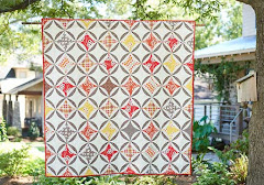
The Clematis Quilt below, created by
Stacey Day, is a great example of color play between 2 different palettes. For
me, I want the projects I feature and highlight in my photo shoots to celebrate
the best use of my vision for the collection and to give quilters and sewists
creative confidence to explore and stretch beyond their comfort zones.
Which is why I love collaboration with friends to see what they would
create with my prints to expand on what I can offer in inspirations. It's super
important for me that people connect with the line and feel inspired and
empowered. I definitely have a way of relating to what I create but I know
there are millions of options and to explore as many ideas as possible is not
only fun but it stretches me too.
And every collection is blessed with fur baby love! This is
Tutu our little female. Our cats adopt everything that comes into our house..
quilts and people. If you visit me there is not a shortage of love from either
one.
My friend Sujata Shah from The
Root Connection and author of Cultural Fusion Quilts graciously
quilted this beautiful small quilt top using much of Splendor and
some nice
dusty solids and some older Amy prints. She has a great eye
for design and I love the depth she creates with the combos of solids, textures
and florals. I also think she
My friends Heather Jones { 2nd from top } and Suzy Williams {
3rd from top } created these fabulous blocks after inviting them to create
with Splendor! I love Heather’s minimal use of
two prints and a solid and featuring her Fly Away quilt pattern. She downsized
her master quilt into this mighty powerful block. And Suzy’s confident,
whimsical use of solids with a mix of Splendor is playful and fun!
Another big focus for me when I create a collection is to
think of the multiples uses for a print. For myself, I love to both quilt and
make garments and accessories. And I know there are many schools of sewists
with many needs stitching with my fabrics because of their beauty but also
because the inherent quietly of our FreeSpirit
fabrics makes it super versatile. There is enough sheen and
drape to make some striking bags and garments and of course the finished hand
on a home made quilt cannot be matched. You can see my Native Folk print is used successfully
here at a quilt backing.. I often create designs that can be cut up or featured
in a variety of ways and this one crosses over nicely.
Here is the same print in a new color way detailed out with
machine quilting on my Newly updated Gypsy Sling PDF pattern. Again, you
can see how successful this print is as an accessory design.
And then used here as a perfect border print for my Bohemian Wrap.
My buddy and fellow FreeSpirit designer Tina Givens www.sewtinagivens.com created
with my Native Folk print in her Meri Tunic dress pattern. Another completely
fresh approach to stitching with the same design. This really excites me!
And Native Folk used in my " work in progress” loosely
inspired from my free Hapi Quilt pattern . Sheila and I
are making good use of my Splendor scraps in the studio and
stealing every moment we can to build out this fun wonky design! This is a
satisfying project to work on because it’s so organic yet the colorist in me
likes to play within the harmonies of a color way. The strips are foundation
pieced and mistakes are welcomed because the design just gets more and more
interesting. That’s how I like to quilt.. organically, like making a
painting.
In the end the launch of a collection is a HUGE celebration
of creation and collaboration. I am always proud of the end product that I work
hard to make the best it can be with my power team at FreeSpirit and Susan,
Dave, Sheila and my local sewing friends. These are the many hands behind the
scenes bringing a line to life. I want to invite you to come play
with Splendor and join my fun Pinterest
Splendor Contest! You can learn more about it here. And join me on my social media pages and
share your favorite Splendor experiences. I’m most excited to
see what you create! Enjoy and much love!
XO Amy FB/IN - @amybutlerdesign TW -
@AmyButlerDesig1


1 comment:
Wow,love these colorful fabrics!
Post a Comment